Widgets
Widgets
ON THIS PAGE
Widgets are used to add page content. Some widgets reference "page types" in the content tree. These widgets will pull in this content so you wont have to edit them on the individual page. Other widgets are editable within the widget properties on a page.
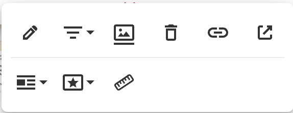
To view the widget properties click on the gear icon on the right hand side when hovering over the widget (this does not apply to rich text).
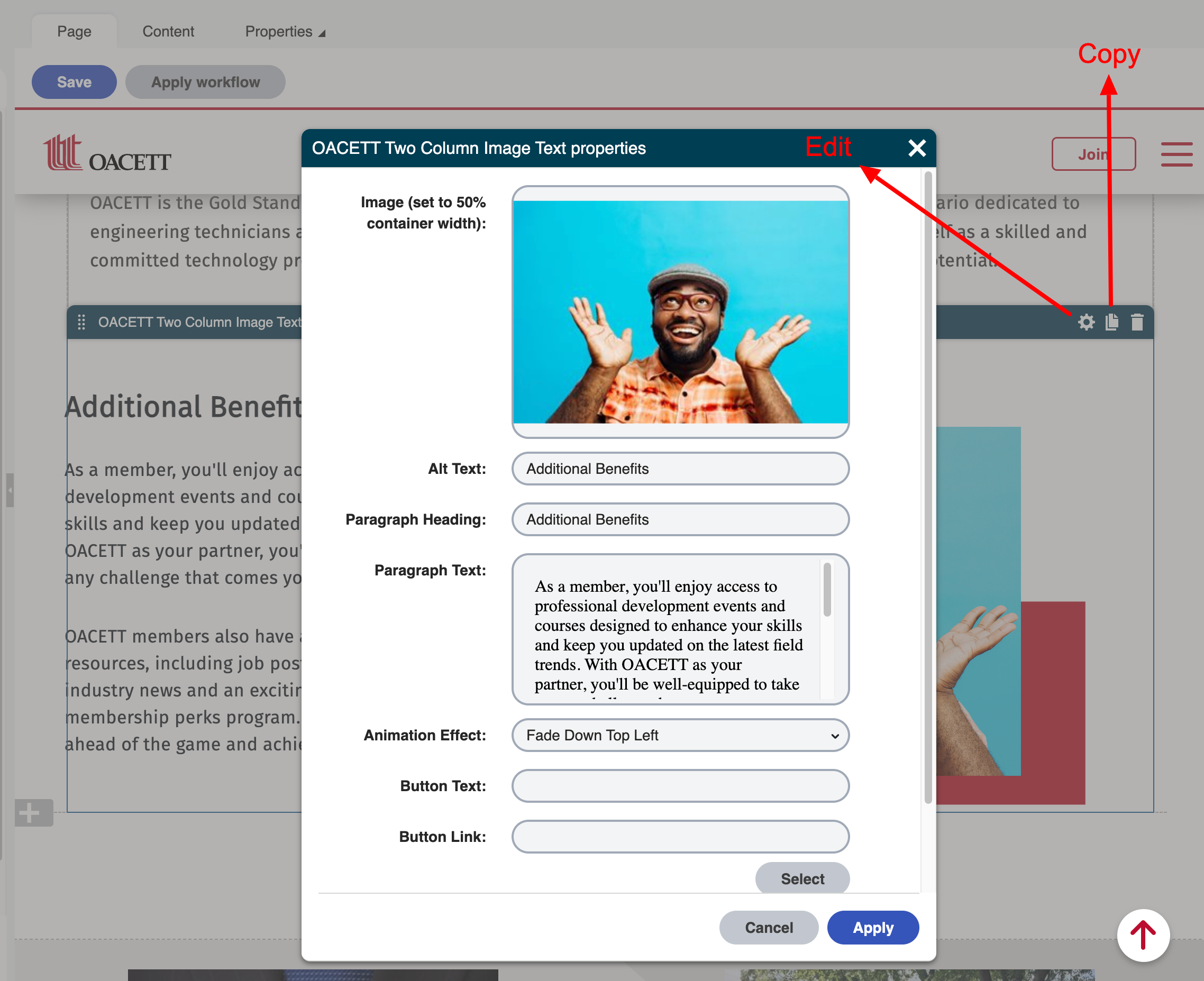.png)
Note: if you click the "copy" icon next to the gear icon on the widget it will make a copy of the widget. When you go to the widget menu you will see it copied on the list. This is helpful if you like the styling and content of a widget or what to reuse the widget.
Content Editing Widgets Used on the website
Widget Description / image Spec | Widget / Image |
|---|---|
Homepage Banner Image: 1366 X 555 px |
|
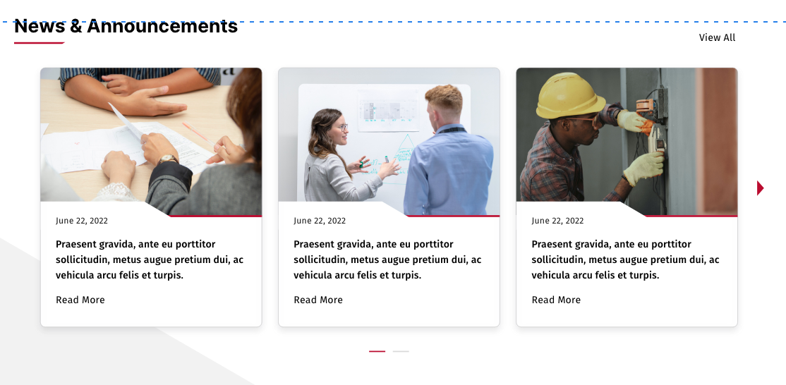
Home Page News Cards Image: 356 X 237 px Connects to "news" page types |
|
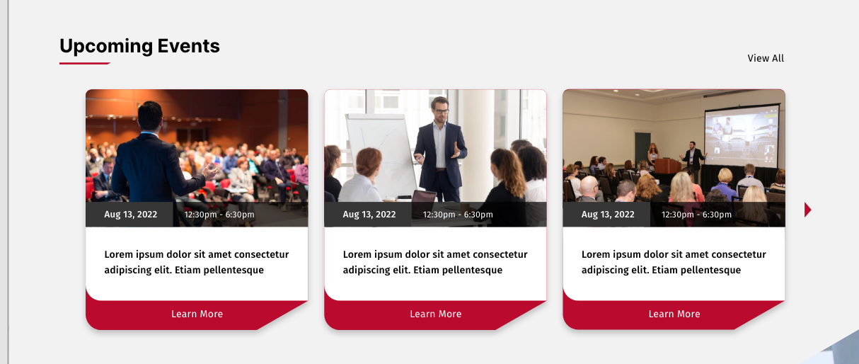
Event Card Image: 356 X 240 px Connects to "event" page types |
|
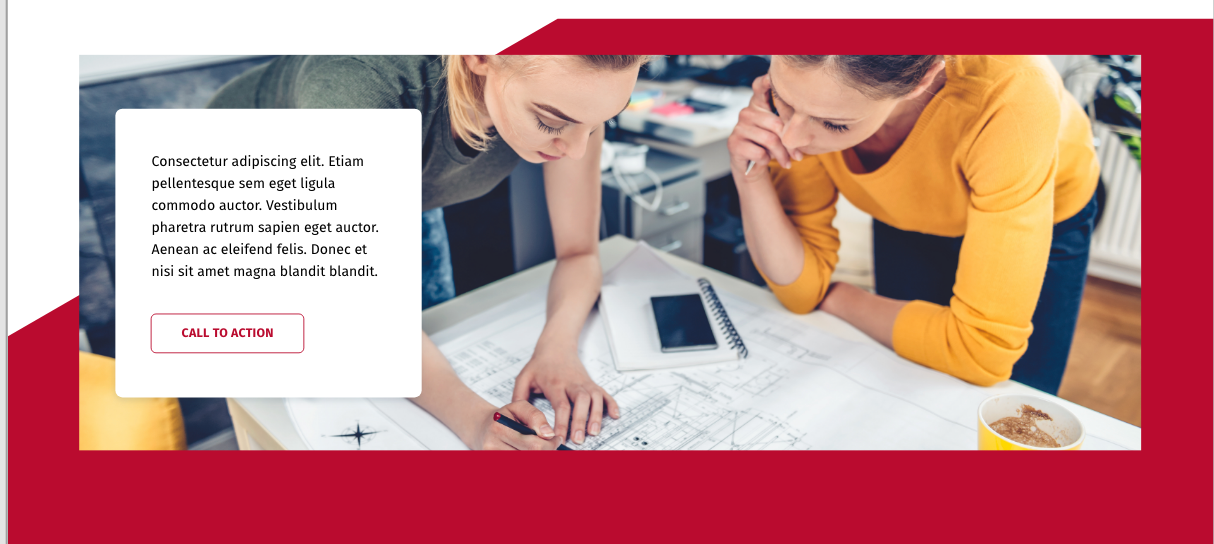
CTA Image: 1366 X 761 px |  |
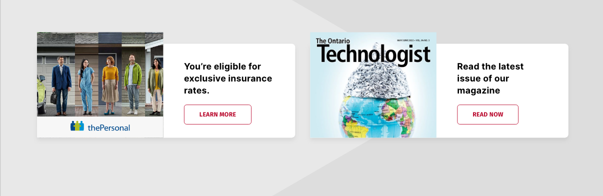
Publication Card Image: 286 X 239 px |
|
Banner Image: 1366 x 321 px |
|
Video |
|
OACETT Image Widget Image: 758 x 475 |
|
OACETT Two Column Image Text Image: 592 x 385 px |
|
Two Column Image Text Image: 430 x 388 px |
|
Info Block Image: 1203 x 448 |
|
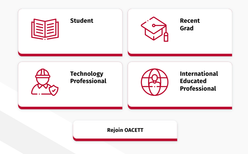
Call out cards (these will have preset icons to chose from) |
|
Anchor Links: |  |
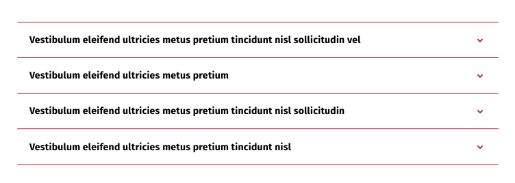
Accordion: This widget references the "Accordion Tab" page type. Best practice is to create a child folder on the page you want to add the accordion to. Add the accordion tab page types there. Link to the folder with this widget. |
|
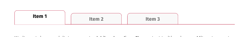
Tabs This widget references the "tabbed content" page type. |
|
Course Card & Webinars 277 x 150 px | 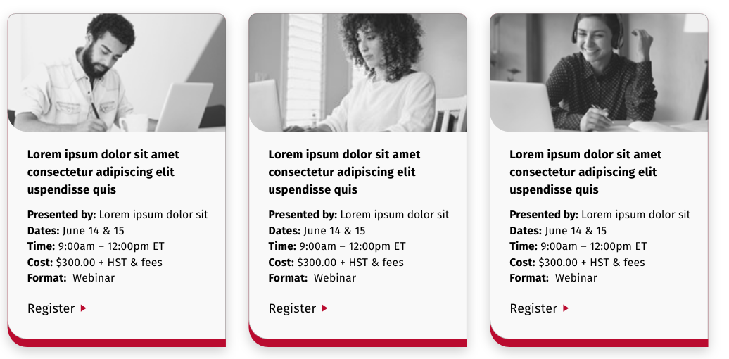 |
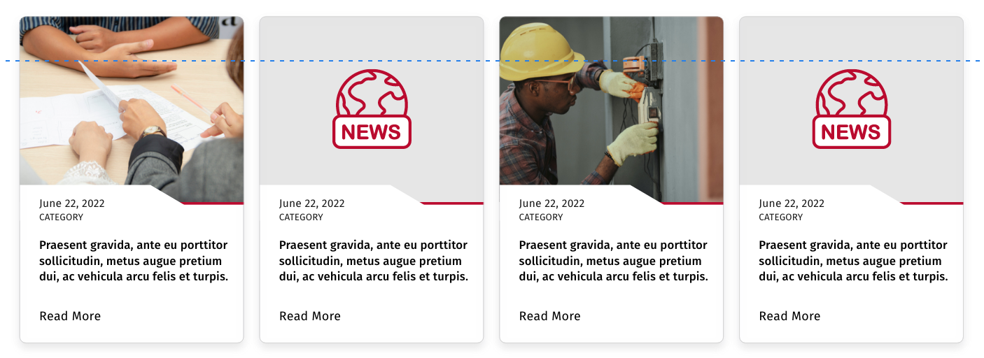
News cards 286 x 237 px |
|
Article Image Insert 694 x 321 |  |
Rich Text Widget | Used for most test content. Can be used to add images and includes styling. See below for more details |


Rich Text Widget
Rich Text Styling Options
Use the backwards "P" paragraph styling icon to select headings and font style
Heading 1
Heading 2
Heading 3
Heading 4
Heading 5
Heading 6
- Normal Text
- Bold Text
- Underline
- Link
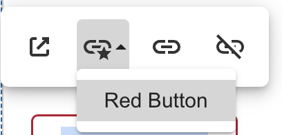
To create a link button. Highlight the text you want to link:
- Select the "insert link" chain icon (beside the picture icon)
- Click on select to select the page
- Once you have your link it will work as an underlined link (good for links within sentences).
- To add button styling click the link once and you will see a styling menu:
To add images:
- Select the "image icon"
- Click select to select image
- Change the dropdown to say "Images" or other media library (it defaults to Documents)
- Find or upload you image
- Click select
- Click on the image to get the image editing options (below). Normally you will want to adjust the size or alignment. Setting the width to 100% will scale it to the width of the rich text widget.
Other Styling within the rich text widget:
- add bullet lists by selecting the text and selecting "unordered List" Icon
- add numbered lists by selecting the text and selecting the "ordered list" icon
- note that sometimes styling is copied over from another document and the spacing is too large. To fix this just highlight the list and click the button again and it will correct the spacing.
- Indent the text with the last two icons on the first row
- To view code or paste code (like an embed) click on the code view icon (the last icon)
- To view the rich text editor in full screen mode click on the fullscreen icon next to the printer
Best practice for the rich text widget is to use multiple rich text widgets on the same page to split up the content. This allows you the flexibility of adding anchors or other widgets in between to split up content. It also makes it easier to use the editor because the controls are at the top.

